Wednesday 28 December 2016

[COP3] Finished Animation

Less Movement

More Movement

Rearrange scene

Final move movement animation

METHOD

Aim

It is said that movement is an essential element when anthropomorphising an inanimate object. The aim of this animation is to explore the use of movement in animation and to compare the result of two animation with different amount of animated component. I am hoping for distinguishable outcome that one of those two animation could assign more anthropomorphism and empathy from the audience without dialogue or text. I also want to investigate whether anthropomorphism could attribute personality or character to the object from the audience.

Target Audience

My target audience are general public from age five upwards. Normal people how are able to recognise emotion and feelings. Best to have basic knowledge about respiratory system(not compulsory)

Procedure

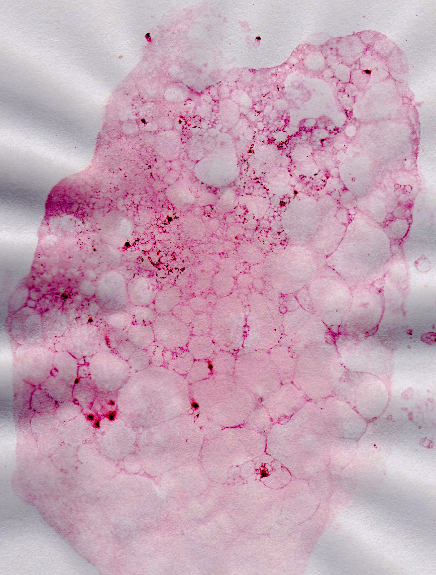
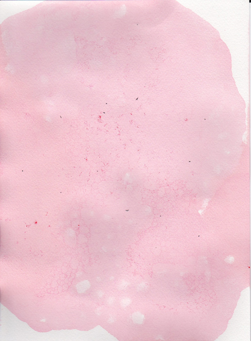
It is an animation about the respiratory system that do not include narrative or dialogue. Different texture are introduced into the animation by scanning and photoing in materials as well as editing in Photoshop and Aftereffect. The main characters are an oxygen molecule and carbon dioxide molecule which are designed with no face and humanised body hence no facial expression or gesture that audience could connect to directly. The story begins with a zoom-in scene that introduce the micro-particles in the atmosphere. Particles' movement  is caused naturally by the flow of air so as to clarify that no human emotion or feelings are attributed onto the characters though altering at the first place so it is believed that the moving oxygen and carbon dioxide could be gradually characterised by show sequence of dance and staying together to show a bonded relationship. Suddenly, the oxygen is sucked into a human body via inhalation and audience follow it into the body to begin the journey. In the less animated version, characters do not bend or stretch, just maintaining the same volume with a few rotation movement throughout the whole story whereas the characters in another more animated version could squash and stretch, moving their body to pull forward. The inner body parts are animated more vigorously and introducing the body as a character as well. Consequently, the oxygen is taken into the lungs, comprehends gas exchange, and would be consumed by the body. Its carbon dioxide friend waiting outside would never see it again and follows the air current to another place eventually.

Results and Evaluation
The comparison of the two version of animation proof the statement of the importance of movement in object character from Paul Wells and discover new ideas and knowledge throughout the production. First of all, there are significant difference between two animation and obviously are the amount of movement. The stiff characters could modestly narrate the story with aids from the background and camera angle for instance showing adventurous inside the mouth by a round torch layer and slow motion scene to emphasise the gas exchange moment. Comparing to the better animated character, the caricature object suggests a lot of feelings by the level of the movement and the familiar sequence of flapping wings. In the second animation, the whole body is animated so as to create an environment of liveliness and every part of the body seems involving in the story. It is suggested that inanimate character without human physical characteristics or any exaggerated performance is difficult to create empathy from audience on its own because the amount of information is hugely restricted by the faceless and non-humanised character design. A massive difference is demonstrated in the scene where oxygen starts becoming alone in both animation. Oxygen character that is animated less is dull and lifeless especially without the help of moving background whereas the same character in the other animation shows more energy and personality simply by providing a constant sequence of movement so it attracts audience’s attention despite of being alone. The more the connection made between audience, the better opportunity for the characters to be anthropomorphised. The aim of attempting audience to see the characters with feelings which is succeed. As the creator of this animation, even with the understanding of the purpose behind, it is irresistible to attribute character onto the oxygen and carbon dioxide which might argue that the ability of anthropomorphising is indeed an instinct of human and it is a gift to create. What is more, the use of material aids storytelling and building up a good character. Object character without the ability to express verbally or physically requires other ways to reveal their thoughts and personality to audience which could be using the suitable texture on the appearance. For examples, the oxygen has an airy texture of a watercolour painting that introduce a lively, light weighted and happy character compare to the solid, intense texture of fabric on carbon dioxide that create a less flexible body and personality to it.


Tuesday 27 December 2016

[COP3] Academic Poster


I wish to put more visuals in the poster but I find explanation is more important. By studying templates from previous students, it is best to keep it simple and include every information that is essential to the project.

[COP3] Practical Production

Inside the lung

From my research, I knew that trachea has a lot little 'hands' to trap dust and other polluted particles call cilia, I animated those like Mexican wave just like how my biology teacher taught us during high school. I include this memory in the animation, hope to make it fun to watch.

 I think the sponge texture is perfect for the heart, it feel squidgy and bouncy like how heart performs. It would suit a solid texture. This let me know that the texture applied could alter the feelings of the object, how audience 'see' the texture allow them to connect with the character.
From the initial text, I already had this idea of using tree branches as the blood vessels and airway. This is the first thing in my head when I saw diagrams of lungs online and after a few editing in photoshop it becomes my thought on paper! I like the right lung more because the branches are more dense, more like what it looks like inside the lung but I do not want to flip it over to make identical lungs or it would look artificial.


bubble wrap as a zoom out version of the lung, makes it more airy and gives volume to them even in 2D. I do not think the bubbles are too big because it is suppose to exaggerate the inner parts. However I do think it needs another version with more details when zooming in.


Here are the completed and comparison between the animated and the less animated version.

I like the animated version more because the character looks more lively and with personality. Although the less animated version still artistic, it might raise less empathy from audience compare to the top one because the flying movement tells when it struggles or having resistance. I think it could be improved by making other body parts moves as well like the squashing lungs and stretching diaphragm. I would come back to it if I have time, for now I really hope to finish the whole two animation on time as well as the essay. The time is a bit tight but I think if I crack on it will be fine.

[COP3]More materials

 Blowing colour bubbles on normal paper, fail, nothing shown
Paper creases, although the result is good
 Blowing colour bubbles on water colour paper, success! Love the outcome and I am using this as the alveoli.


I really love using texture and it gives visually interesting result to the animation. Unlike the usual animation, texture enable feelings, as if audience could touch the characters. I have so much fun working on materials!

[COP3]Production time!

I tried using particle playground effect on the molecules so as to introduce an atmosphere stage. The random movement is difficult to get. I did a few tests on this scene including experimenting with colours and speed and gravity of the particles.

I do not like the blue background because it erase oxygen and the particles are not standing out. I like to change the background to a lighter colour .

I end up using orange because it makes the characters pop, also link the previous scene as well. I also blur the particle layer to focus on the main role, which fly across the screen with high speed. I do not know if another layer of particle is needed, I tried but the scene become too busy. However I still want more depth to it. Therefore I think blur solves this problem and I am happy with the result now.

[COP3]feedback from Mike on essay

We handed in our essay to Turnitin last week and got some feedback from Mike today. I have about 5000 words now which is alright and still have quite a lot to mention.

The general feedback of the essay is good. Mike said I got some good points but most of the chapters need illustration to support and also some spelling mistakes. Since the essay is still in progress, I want to add in pictures afterwards and focus mainly on typing from now. I noticed that i would take quite a while to finish the whole essay and also needed to be proof read by someone as well. Mike also said I need to continue linking my questions to the examples and have to start writing the practical as soon as possible. I think I am on schedule and very up to date. I nearly finish my animation so I would be able to start the practical chapter before Christmas break. What I need to improve is probably the speed of writing which could be done by organising the chapter before typing because I do babble a lot once started. Also remember to link back to the questions I stated which could be achieved by sticking a memo note on my laptop!


[COP3] Production


Once my idea was developed, I quickly did an animatic to calculate the time and number of scenes. I thought it was quite demanding and it ends up have more than 2 mins. Despite of the time, I really hope to finish the whole animation and make a more 'cartoon' version of it. It requires good time management and animating skills to finish two 2 minutes animation in a limited time. I had made a plan and should be alright if I follow through which enable me to take balance between practical and written work.


I started by creating all the components first in photoshop. This includes all the scanning and photo-taking. I am happy that most of the texture did not lost during scanning and could show complete different between different materials.


watercolour, hue edited in photoshop


felt


buttons


Sea salt on black paper, edited in photoshop
sponge fibre


photoshop drawing

sky from real photos I took when I went to Lake district

From the light projection project we did in PPP, I learnt from James about making sphere. It is very visually interesting approach to make 3D in aftereffect. It allows layering textures on top, rotating in different speed. I did a few tests and came out with a satisfying result.

I also did a test on how I want two molecules meet. I know I would like slow motion to exaggerate the scene but not sure about the composition and background yet. By doing so, audience could have more time to look at the design and sensing the importance of the scene. Hope this camera shot could raise empathy from them.

Monday 26 December 2016

[COP3]Character design

Mike suggested me to reconsider about the character design because it should be created based on fact instead of any shapes that just look good. Therefore I had some scientific facts about molecules from my pharmacist friend, produced other character designs according to that.

Initial Sketches
Knowing the bond angle of the molecules, it is better to include them in the design. I do not expect audience would understand the design at the first place but it would be quite surprising if they found of that the design is relatable. CO2 is one big carbon and two oxygen so I am creating an oxygen that would appeal on its own also when bonded with carbon.


Colours


It gives me a feeling that oxygen should be blue because of the lightness?(although molecules are all super light). There is no sign that these molecules originally have colours so I decide to use blue to contrast the inner body also would stands out from other organic colours. I use orange for carbon, a more solid colour but not as intense as red, giving it a grounded personality and it would be moving less airy than oxygen. In order to make two molecules more recognisable, I darken CO2's colour to give an impression that it is a greenhouse gas. Being a waste product does not feel good I suppose so a darker colour also allow more story in the character design.


I want to introduce as much texture as possible. However I found difficult finding airy texture and a molecule-like texture... Instead of just randomly arrange the texture, i did my best collecting various material. I absolutely enjoy layering the textures on the shapes, testing out different effects in photoshop makes textures pop out so as to become a very unique design. 

Oxygen:Canvas texture
Co2: fabric print and sponge fibre
Nitrogen: Sponge fibre and butter in the middle
Neon: Aubergine skin


I did not like the canvas texture on oxygen because it makes it very plain and solid. I hope to show light weight and airiness of this molecule. I do not like the fibre texture(from a sponge) on Co2 on top right and nitrogen on bottom left neither. The material make them stiff and dull. The different in colour should be enough for recognising the character so I could light up the colour a bit in order to soften out the look. I like neon on bottom right and i use neon colour as well so I am keeping this design.

Oxygen: Watercolour paper
Carbon dioxide: Kitchen roll and fabric print
Nitrogen: Knit and butter in the middle
Neon: Aubergine

This is the final design design that I am happy with. I scanned in a watercolour paper for oxygen on top left. It gives it a airy/ smoky appearance that match the floaty oxygen impression. Carbon dioxide's oxygen is replaced by tissue paper. Visually looking light weight but the darker colour tone down it a bit but the same tone of colour should inform audience that they are same material in different stage. Knittings in Nitrogen gives a strong bond appearance to it. Keeping Neon the same. I test it on pinkish red background to see whether they pop inside the body. I am very happy with the design and will soon start the production.

Meet The Puppet Masters: Masterclass Talks 5/11/2016


Brian Cosgrove, Barry Purves, Merlin Crossignham and Shaune Harrison

I went to the 'Meet the Puppet Master' masterclass, hoping to get some useful information towards anthropomorphism in animation. Traditional puppets are still objects without replaceable faces or body parts, puppeteer manipulate them in order to show different emotion and feelings through various poses and body language. During the day, there were four different professional puppeteer talking about their career and mostly introducing puppetry. Some were not very useful to my research but one puppeteer had given me a vital message about anthropomorphism in object. Mr Barry Purves talked about his journey with puppet and he mentioned about the use of puppet. He claimed that puppet is a mask, audience could not see the puppeteers behind so it is physically hiding the artists. However, it is actually revealing, puppet reveals more than covering. Purves said having a media allow more sincere expression, for example people tend to type more aggressive things on internet instead of talking face to face because the social network act as a mask, hiding their identity but allows them to reveal their true feelings more comfortable. It is true that every move of the puppet is a thought of the artist. Many use of object in live action film is to let it 'speak' for the actor interacting with it for example in Castaway, wilson the volleyball is symbolising the loneliness and the urge for company of Tom Hanks; the talking parrot umbrella speaks Mary Poppins' mind and many more. Even though some of them are not animated, they still about to create empathy from audience because of the connection between different characters and the needs of it. When emotion is projected onto the object, it is difficult to not feel for it, when there is a story behind, it is unable to forgot.