Wednesday 27 April 2016
COP2 Visual Response: Final Animation
This animation is a visual response to my essay question: How has the representation of female in Anime and Manga in Japan changed over years? In the essay, I talked about the history, the triggers and real situation of females has in Japan which has a huge impact on the female characters in anime. I have discovered so much and have generated a thought inside: The female anime characters might want to fight against male gaze as well, and this is the original idea of the animation. I know that anime characters especially female characters suffer gazing pressure from male audience, creators and also from the society and even female creators in Japan have the gaze implanted in their mind that all the females anime characters are there to satisfy some kind of desire and the purpose of the animation has changed dramatically since the first 'shoujo' anime (anime for girl) Princess Knight.
I am presenting the first part of the animation and I am very proud of it. Considering Cop is a very difficult module to me, I am having fun and learnt so much during the production. I have learnt how to increase the femininity on character by giving her some tiny features like pinky finger (I call it princess hand), long hair and perfect body that are how male portrait a perfect female character. I would like the emphasis the stereotype on the typical female characters in anime through out the years and so that audience could released how boring it is to have a similar style over decades. This could also encourage creators to break the boundaries and also raise the awareness on female welfare in Japan because we could all spot the problems by anime and how the anime girls are being designed.
I am very pleased with my first flash animation and I found out that flash is a very useful tool even better than photoshop when animating. I would love to use flash more in the future and practise during free time. I have challenged myself with a new drawing style, new animating tool and writing about it. Cop is very hard but I slowly find it useful and helpful.
COP2 Visual Response: Background Designs
I love producing the backgrounds and I like how they turned out at the end. I use brush tool mainly and some filters in photoshop to make it more watercolour looking. To fit the topic, I use cold colour but a pitch of red in the woods in order to make it more natural looking.

I have learnt to use clipping masks to draw on the area I want which is very convenient and speed up the working time a lot . I also learnt to start with a darker colour first then work the colour from dark to light which allows more depth and save time when layering colours on top of each other. But I do not know what to add on the ground and it seems a bit too blank. From the snow white background reference, there are rocks and chopped tree which I do not want to be included in my animation so I add a layer of watercolour texture instead which make the ground more grass like and texturised.


I like the truck very much! Studying from real pictures really help to draw more realistically.


I am very impressed with the transformation from line work to the final outcome. I think my digital painting skill has improved and it also allows me to use gradient colour to show the depth of the environment.


Studying from reference, it is a good way of showing depth by having some light penetrates the trees from the back to the front. It not only allow a sense of distance within the illustration but also a feel of mysterious of the forest.


At this point, I need to finish colouring the animation and then it is finished. I do not think music at this stage is needed since it is only a part of the animation. It is very hard to choose a specific music for only one part of the animation whereas it is the only product I am producing. Might be at the future when this is completely finished, it deserves a background music.
I also try so hard to make consistent quality of line which took me a lot of time doing so, but in schedule wise, I am very up to date and ready to finish the animation and the blogs for submission this week.
COP2 Visual Response: More Research and Character design
I decided to use flash to animate. I have never used flash and I have to learn from the basics by looking at youtube video and experiment with different tools. I think this is a good opportunity to test with other animating tool that I have never used before but it is also timing consuming at the same time. Considering the time I have left till submission, I think it is manageable to try some new techniques and applied in my animation.
There are a lot of tutorials online and I just randomly chose one to start with, This guys did quite well explaining the tools and other basics but not really useful in demonstrating the animating process.
I learnt a lot of hot keys from this video, he shows many useful short cuts and the use of the tools and talk about symbols and tweens as well which is very useful.
Although this video is very long and boring, it shows the production of a short animation. He demonstrates how to animation effectively and use a lot of hot keys and layers as well and i think I could start animating after looking at all these useful videos online.
I started with basic line drawings on different layers that enable efficient colouring afterwards.

Then I export the images and edit them in photoshop so that I could can more beautiful background that are done in photoshop instead because flash does not really good in colouring and less colouring options then photoshop.


I used very thin outline on every thing I draw and they need to match the backgrounds that I was producing. The backgrounds are very similar to the Princess Knight. Most of the early anime backgrounds are created by watercolour and poster colour. I also look at old disney films' background and found out snow white has close aesthetic that I would like to combine both into my animation. The watercolour background is very beautiful and could make the character stands out.
I want to maintain the anime style through the backgrounds so they are not going to be like the sleeping beauty's and princess mononoke's which are not anime style and too realistic. I like the snow white background because it shows some mysterious aspect of a forest and the trees are very similar to the trees in Princess Knight. I am going to mimic watercolour through Photoshop and experiment different brush and strength,hoping to get a good result.

The characters design of the main character at the first part of the animation. There are a lot of similarities with Princess Knight and I do hope audience to relate my character with the old style. The head is relatively big so that the emotion could be shown more clearly while the hands and the body shape is very similar to the reference. I only use blue on her dress because this would make her stand out from the forest but not being too obvious than using red. The curly hair is also a main feature of the design that it appears in many female characters back in 1960's.

COP2 Visual Response: More Researches
Before starting the animation, I want to finalise the character and the be familiar with the 1960's-1970's style. I looked at different anime opening theme song and see what is the common features the characters had at that days.
I would say a lot of the early animation really aimed for kids and very children friendly. Along with the music, the animation shows a lot of similarities with old disney cartoons and there were no doubt that the old Japanese anime adopted a lot from them. I think the first part of my animation is going to be very similar on the styles and content but less cheerful element and more dark than the old Japanese anime because it is going to be a serious topic so I hope to show it through the introduction.
After observation, the anime girl at that time did not have huge eyes like now and do not stress the sexuality of females. The body shape is very normal and usually the characters are slim and healthy looking. Although many of them wear short skirt, there are no sign of being a kind of fans services and I interpret that as cute rather than erotic.The use of colour is very bold and always have red, blue and yellow. I would like to use princess Knight's style more in the animation since it is mentioned in my essay and the style will be more engaging with the essay.
I also like to consider the background as a important part of my animation and more research need to be done on forest background.
COP2 Visual Response: Development
Originally I decided to use traditional animation method to create the animation because is the close the techniques back in 1960's and I want to practise paper animation skills.
During the production, I feel that it is very bad planned. I soon lost the sense of timing while animating on paper. I did not plan the frames and timing well enough and made a mess on the timing and also the background. I did not have a proper character design but started animating straight away. I thought it would be alright because it is just the first part of the animation but soon I noticed that it totally will not work like this. The idea is constantly changing and the character and the thing she is doing do not match my concept and the animation just doesn't make sense.
The colouring do not look nature and very uncomfortable to look at. It does not have the 1960's style but very messy instead. I hated it, so much.


This test animation took wasted me three precious days and I would like to quickly end this text.


I have learnt a huge lesson: Have a good plan, follow the plan, research, and be patient. Let's forget about this and move on.
COP2: Visual Response Animatic
I have changed the ending of the story for a bit in order to make it more related to the essay and more like a complete story. Basically the story separated into four parts: part 1, 1960's style and and classic scene where the main character is playing in the forest and soon the monster(the male gaze) attack her and swallow her in darkness; part 2, 1990's style, the girl time travel to another time zone and found out that her outlook is changed and she has magical power that could allow her to transform into hero and she wants to fight against the monster but the monster grows a lot stronger; part 3, 2010's style, the main character starts feeling uncomfortable about the change in appearance and constantly being changed into some characters she does not like. She wants to break through this nightmare and realise the only way to escape is to go back in time and be strong to refuse any changes; Part 4, go back to the beginning, she escaped through the time tunnel and wanting to retain her own identity.
The story is mostly encouraging females in Japan to stand firm to their identity and protect the representation of females characters in films or animations. I hope the animation could show show the unequal and uncomfortable situation female have under powerful male gaze in Japan and how this is directly affected the position of females in Japan. Since local animation is a reflection of the social, I think my visual response is very meaningful but yet too obviously. I am happy with the final animatic and really cannot wait to animate it.
After talking to Mike, he suggests me to animate the first part of the story since the animatic is about 2 minutes long. In the first part of the animation, I would like to mimic the early anime style like Princess Knight that is mentioned in my essay and try to show the different clearly between different style in time.
Tutorial
I had a tutorial with mike on very early stage. I was still not really sure about my topic and have not done much research and development work to support my thought. Nevertheless mike helped me with some suggested movie and document that I could watch and consider about the content such as perfect blue and paprika that are relevant to my topic. He also suggested that my topic is too specific that I might struggle to write therefore I think about the topic again and come out with a similar topic as last year: How has the representation of female characters in anime changed over years in Japan?
This is going to be a social based essay analysing the reason behind the stereotype people have on anime and why is this happen and more important issues behind.


This is going to be a social based essay analysing the reason behind the stereotype people have on anime and why is this happen and more important issues behind.


Institutions and Institutional Power


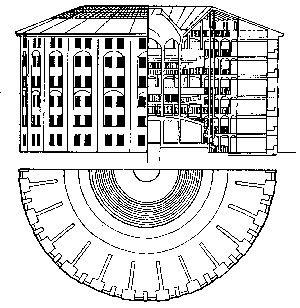
Panopticism is a social theory, originally developed by French philosopher Michel Foucault in his book Discipline and Punish. The "panopticon" refers to an experimental laboratory of power in which behaviour could be modified, and Foucault viewed the panopticon as a symbol of the repressive, disciplinary society of surveillance. (wikipedia, panopticism)
The structure of a Panopticon is basically how jail is designed now a days. I have never questioned the structure of jail or other similar institution where panoptictism concerns the systematic ordering and controlling of human activities. There are always cells for individuals and a centre point which everyone could see and be examined by whereas each individual did not have the ability to communicated with others and the only vision is the centre examination place. This system is believed to be effectively and efficiently modify someone's behaviour. Surprisingly, from the lecture, we know that school is exactly the same. For example lectures are panopticons, students are in cells and everyone is focus on the lecturer who is trying to change our point of view of certain things. Personally I think there are more disadvantages than advantages. This way of teaching not only take away students' freedom but allow the ability to interact and communication with peers. They could only absorb the knowledge from the lecturer but lack of self interpretation. This is therefore discourage in many school nowadays, for instant college is now encouraging 'The flipped classroom' in stead of traditional teaching system where students could have more self-directed time and very depend on whether students could behaved on their own.
Panoptictism in nowadays included surveillance in stores or on road. We are monitored by different institutions that although we have freedom to do anything but certainly at the same time we are being watched to behave and constantly living in a prison. People like going online to commit crimes due to the relatively more freedom they could get through network but some places like China like to control everything the citizens do include social network.
Internet censorship in China is extreme due to a wide variety of laws and administrative regulations. In accordance with these laws, more than sixty in the future Internet regulations have been made by the government of China, which have been implemented by provincial branches of state-owned ISPs, companies, and organization. The apparatus of China's Internet control is considered more extensive and more advanced than in any other country in the world. The governmental authorities not only block website content but also monitor the Internet access of individuals; such measures have attracted the derisive nickname "The Great Firewall of China."(wikipedia Internet censorship in China ) This might be hugely related to the communist background of China. In 1998 the Communist Party of China feared the China Democracy Party (CDP) would breed a powerful new network that the party elites might not be able to control.The CDP was immediately banned followed by arrests and imprisonment. This is also a form of Panoptictism and I very hugely disagree on treating their own citizens as prisoners. I am very interested in this topic and there might be a chance on writing my COP3 essay on this topic.
Subscribe to:
Posts (Atom)